

Seasonal Colour Trends for a Timeless Interior
Why Timeless Beats Trend-Chasing
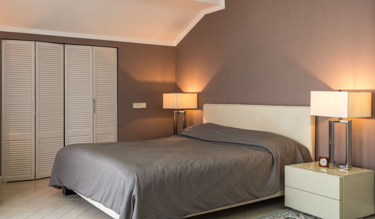
Every season brings a fresh wave of colour predictions, but repainting your living room to match is rarely wise. Fast-moving trends date quickly, and the cost of overhauling a scheme every year adds up. A better approach is to build a timeless interior with muted earth tones and classic accents, then update the look using cushions, throws, and affordable accessories. Separate the fixed elements from the flexible ones: walls, floors, and large furniture form the backdrop, while soft furnishings and small objects are the seasonal layer.
This way, your home feels current without ever feeling disposable. You get the pleasure of a fresh look each season, but the bones of the room stay calm and coherent.
Build a Timeless Foundation
Start with colours that feel grounded. Muted earth tones suit British homes because they echo the landscape and flatter our changeable light. Think warm oatmeal, mushroom, clay, stone, and soft putty. For classic accents, add deep navy, charcoal, or forest green. These shades are quiet enough to sit alongside almost anything, yet have enough depth to stop a room feeling flat.
Always test paint samples on the actual wall. Light direction matters. North-facing rooms can turn cool colours grey, so lean towards warm undertones such as ochre, terracotta, or biscuit. South-facing rooms can carry cooler shades like sage or slate blue without feeling chilly. Paint large patches and live with them for a few days before committing. For fixed elements, keep floors natural wood or neutral wool, and choose sofas and armchairs in oatmeal, taupe, or charcoal.
Seasonal Shifts Without Repainting
Once the foundation is set, you can change a room’s mood in an afternoon. The simplest method is swapping soft furnishings. Buy cushion covers rather than whole cushions, and store them flat in a labelled box. Do the same with throws and table linen.
For spring and summer, choose lighter, airier tones: blush pink, pale sage, sky blue, and soft yellow. Linen and cotton feel relaxed. A pair of linen cushion covers in a muted stripe can lift a plain sofa instantly. Add a lightweight cotton throw in a pale neutral.
For autumn and winter, bring in richer, warmer shades: rust, ochre, deep plum, and olive green. Velvet and wool add cosiness, and deeper colours help a room feel snug when nights draw in. A couple of velvet cushion covers in burnt orange or burgundy, plus a chunky wool throw, will transform the same sofa.
Texture and Affordable Accessories
Colour is only half the story. Texture changes how a colour reads, and it is one of the most affordable ways to update a scheme. A muted earth tone in smooth cotton looks different from the same tone in nubby wool or soft velvet. Mix a smooth linen cushion with a textured boucle or ribbed wool. Add a woven jute rug or a matte ceramic vase next to a glossy lamp base.
You do not need to spend a fortune. Lampshades are a perfect example: a new shade in a seasonal colour or texture can alter the mood of a corner, and they are easy to store. So are art prints, which can be rotated to shift the focus of a wall.
Other low-cost heroes include:
- Cushion covers: buy covers, not filled cushions, and keep a collection for each season.
- Throws: a single wool or cotton throw folded over a chair adds colour and warmth.
- Vases and ceramics: a few handmade pieces in earthy glazes tie a scheme together.
- Books and trays: stack coffee-table books with spines that match your accent colour.
- Rugs: a flatweave cotton rug in a seasonal shade changes the floor affordably.
Keep to three colours per room: one dominant, one secondary, one accent. This prevents a space from feeling cluttered, even when you rotate accessories.
Making It Work in a British Home
British homes have their own quirks: small rooms, period features, and light that can be grey for weeks. Muted earth tones and classic accents are made for these conditions. They soften hard light and add warmth without shouting. If a room is dark, avoid cool greys and icy blues. Choose warm neutrals and add a mirror opposite a window to bounce light around.
For period properties, consider original details. A deep navy or forest green looks wonderful on panelling or a chimney breast, while a warm off-white on surrounding walls keeps the room open. In modern flats, the same palette works well with clean lines and a few well-chosen textures.
A timeless interior is not about freezing your home in one look. It is about creating a calm, flexible backdrop that you can dress for the season or simply the way the light falls on a particular day. By investing in muted earth tones and classic accents, then updating with cushions, throws, and affordable accessories, you get a home that feels current and will still feel right years from now.


Interiors
-
Pull-out drawers, vertical racks, and clever corner units maximise every centimetre in a compact kitchen without making the room feel cramped or cluttered.

Small Spaces




-

Long established fact that a reader will be distracted
-

Long established fact that a reader will be distracted
-

Long established fact that a reader will be distracted




Styling
Karla Gleichauf
12 May 2017 at 05:28 pm
On the other hand, we denounce with righteous indignation and dislike men who are so beguiled and demoralized by the charms of pleasure of the moment
M Shyamalan
12 May 2017 at 05:28 pm
On the other hand, we denounce with righteous indignation and dislike men who are so beguiled and demoralized by the charms of pleasure of the moment
Liz Montano
12 May 2017 at 05:28 pm
On the other hand, we denounce with righteous indignation and dislike men who are so beguiled and demoralized by the charms of pleasure of the moment